rOar’s legacy timesheet system was clunky, unclear, and time-consuming. Employees struggled to log hours, while admins lacked visibility. Goal: Simplify the time entry process, improve clarity, and create a mobile-friendly experience.
GOAL
Simplify the time entry process, improve clarity, and create a mobile-friendly experience.
My role
I led the end-to-end UX/UI process — from discovery workshops and journey mapping to wireframes, usability testing, and final high-fidelity design. I also collaborated closely with developers to ensure design fidelity during implementation.
Research Goals
Understand how users currently log and review time Identify pain points and blockers in the flow Explore mobile behaviors and needs Test clarity and usability of new patterns
Solution
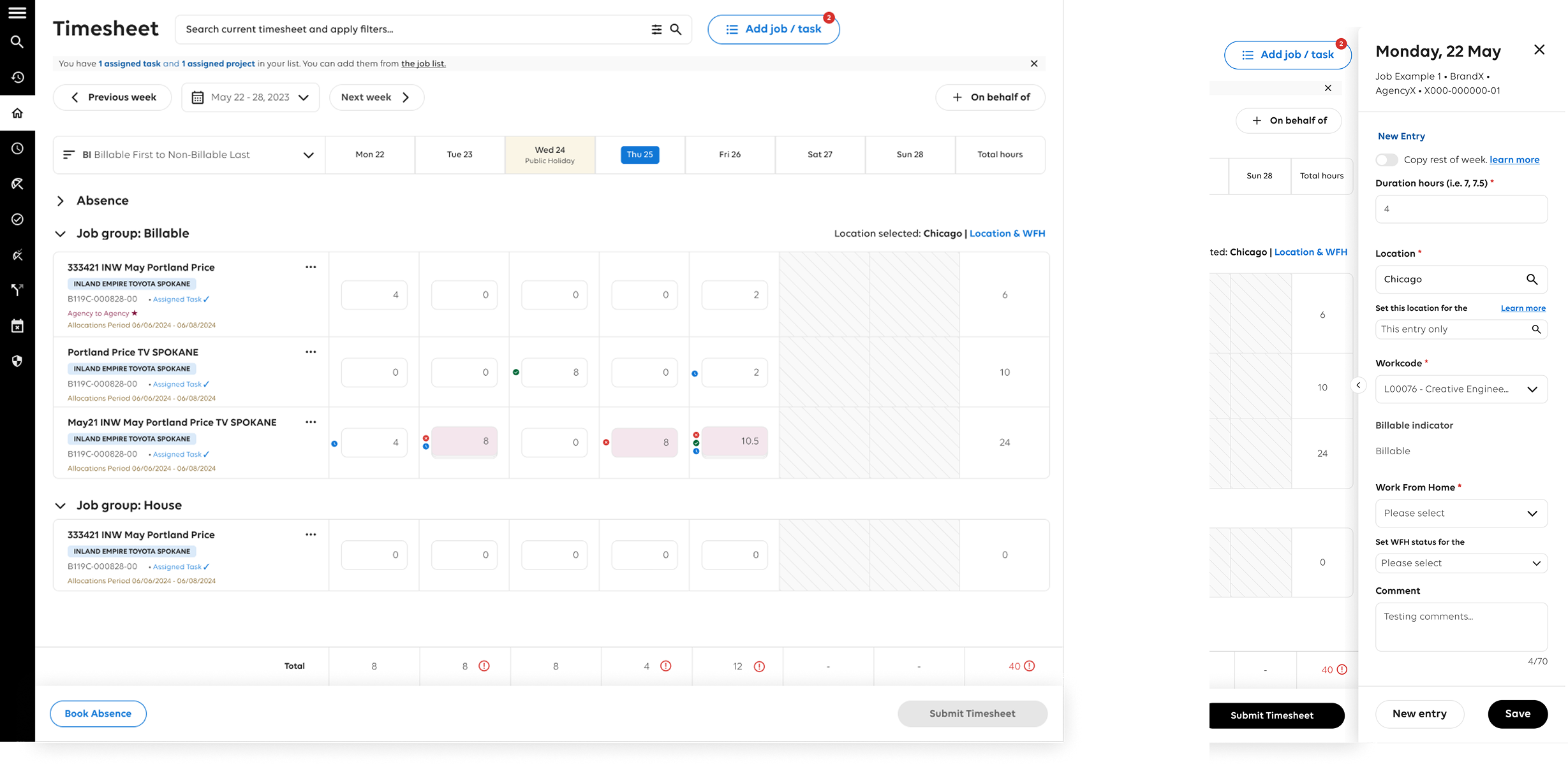
Redesigned the timesheet into one clean page
Removed all pop-ups for a faster, uninterrupted flow
Enabled keyboard tabbing to quickly enter hours
Accessible for all users
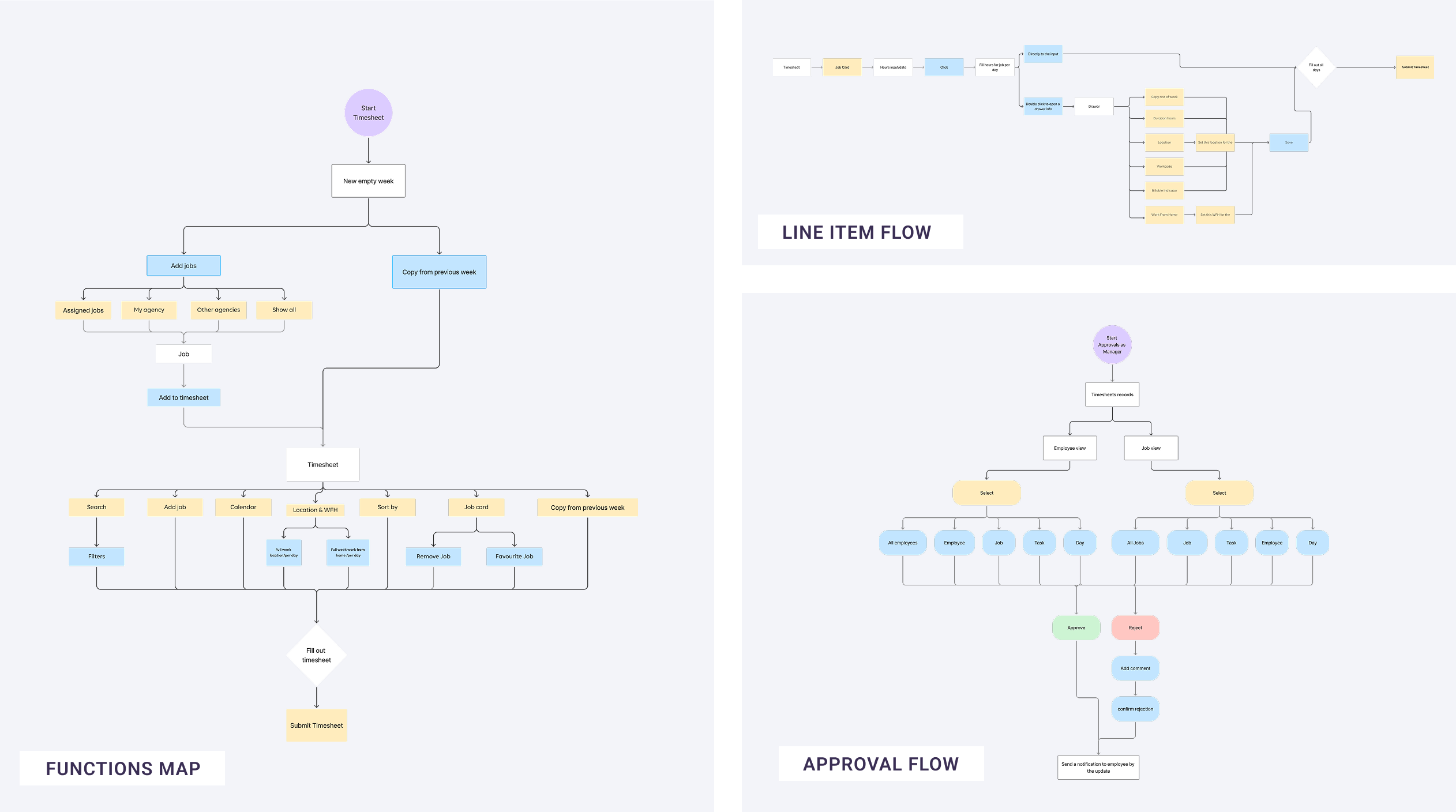
WORKFLOW
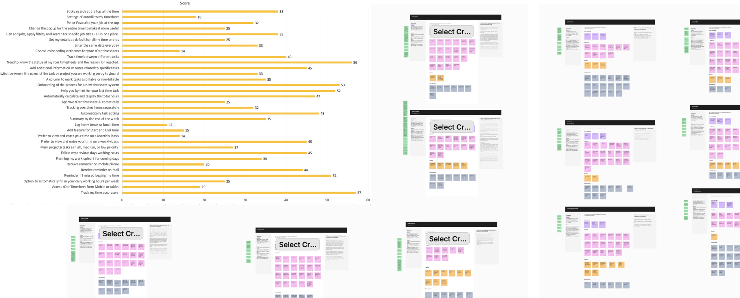
User Interviews & Key Insights
I conducted interviews with 20+ users: employees, managers, and admins to better understand the real-world challenges around time tracking.
The interface felt cluttered and confusing
Many users forgot to submit on time
Simple tasks took too many steps
Accessibility issues made it hard for some users to navigate
Design
Related Projects
Contact me
Available for UX/UI design projects, feel free to contact me for collaboration opportunities.